Geometric Print Pet Carriers: Modern Design Programs
A geometric print stays contemporary at a 6-10 cm repeat, two or three colours, and a registration tolerance no looser than 1 mm. Grid repeat above 12 cm starts to read as upholstery, while more than four colours turns precision into decoration and loses the crispness that makes geometry worth specifying in the first place.
Our production team develops these programs from a 500-piece minimum per colourway, and the first sublimated sample is typically available within 6-10 working days of artwork sign-off.
Executive Summary
Geometric pattern is the most reliable route to a modern-looking private-label carrier because the aesthetic is judged on execution rather than on illustration quality, and execution is entirely controlled by specification. Three numbers do almost all the work: repeat size, colour count and registration tolerance.
Commercial terms are simple. Minimum order quantity is 500 pieces per colourway, physical samples issue from our production team within 6-10 working days once the repeat artwork is locked, and bulk production closes in 35-50 days with inspection to AQL 2.5. Because geometric artwork is vector-based, changes between seasons are quick: recolouring an approved repeat is largely a file operation, so second-season capsules usually skip artwork development altogether and go straight to strike-off.
The cost structure favours restraint. Every additional screen colour adds unit cost and risk, every reduction in repeat size increases panel-cutting precision requirements, and every hard-edged high-contrast design makes finishing defects more visible. Brands that accept those constraints get a capsule that photographs beautifully, blocks powerfully on shelf, and can be refreshed indefinitely without redrawing a single motif.
Personalized pet carrier work splits into two tracks: variable data such as a name, and fixed branding such as a woven label or patch.
What makes geometric pattern read as modern rather than dated
Modernist pattern succeeds on pet carriers because geometry implies engineered precision, and engineered precision is the visual shorthand customers read as quality. A dog owner cannot judge whether a frame is properly riveted from three metres away, but they can absolutely judge whether a printed grid aligns across a seam, and that judgement transfers to everything else about the product.
This is why geometric carrier programs reward specification discipline more than artistic invention. The design authority comes from repeat accuracy, contrast control and how confidently the pattern is interrupted by functional elements such as mesh windows and zip lines. Where pictorial prints hide imperfections inside organic shapes, geometry exposes them; a face loses its power if the triangle rows do not meet at the gusset.
Three pattern families dominate the modern aesthetic. Grid and tile systems, built from squares, rectangles or hexagons, are the most forgiving and the easiest to map across panels. Diagonal repeat systems, including chevrons and herringbones, add motion but demand much tighter cutting control. Optical op-art systems with contrasting blocks are the most striking and the least forgiving, best suited to flat structural fronts rather than soft-sided bodies.
The current retail context also matters. Since 2023, direct-to-consumer pet brands have converged on restrained two-colour geometry for their hard goods, largely because it photographs cleanly in lifestyle feeds and because it survives small-format social imagery where detail disappears. A busy multi-colour repeat simply does not survive being shrunk to a phone screen, which is exactly where purchase decisions happen.
Finally, geometry is gender-neutral and season-neutral. It will not date as quickly as a novelty print, it will not conflict with a retailer's floor palette the way a saturated floral can, and it can be rolled across multiple seasons without markdown pressure. For a brand building a permanent core line rather than chasing a trend, that durability is arguably the strongest commercial argument for the aesthetic.
There is also a useful insurance angle. Because geometric systems are defined numerically, they survive supplier transitions better than hand-drawn artwork does. If a program later moves print routes or adds a second production source, a repeat specified in millimetres and colour values can be reproduced accurately without any loss of brand identity, whereas painterly or illustrative designs tend to drift each time they are reinterpreted by a different artwork room.
Repeat engineering: tiling, tessellation and seam logic
Repeat size determines almost everything downstream. Below 4 cm, geometric patterns read as texture and lose all authority. Between 6 cm and 10 cm, the brain resolves individual shapes and perceives deliberate design. Above 12 cm, particularly for hard grids, the result tends to read as furnishing fabric rather than as travel product, and it also increases the risk that a single mis-cut panel ruins an otherwise perfect piece.
Tiling logic must be resolved before artwork goes to strike-off. Square grids tile trivially but look static at large scale. Hexagonal tessellations tile beautifully and hide curvature because the eye cannot easily find a straight reference line, which makes them excellent for rounded carrier bodies. Diagonal chevrons tile cleanly only if the vertical repeat divides evenly into the panel height, otherwise every piece ends with a partial motif at the seam.
Cutting economics follow from the repeat. A 6 cm square grid gives the marker maker enormous freedom; a 22 cm op-art block forces placement, generating waste that can shift fabric utilisation from 88% down to around 72%. On a 500-piece order that difference frequently exceeds the entire print surcharge, so our production team always runs a mock marker before approving large repeats.
| Pattern family | Recommended repeat | Seam tolerance | Marker efficiency | Comment |
|---|---|---|---|---|
| Square grid | 5-8 cm | ±3 mm | 85-90% | Most forgiving, slightly static |
| Hexagon tessellation | 6-10 cm | ±4 mm | 82-88% | Hides body curvature well |
| Chevron / herringbone | 4-7 cm | ±1 mm | 76-84% | High motion, highest waste |
| Op-art contrast blocks | 12-20 cm | ±2 mm | 70-78% | Best on flat fronts |
| Half-drop diamond | 8-14 cm | ±2 mm | 78-86% | Good mid-energy compromise |
Seam allowances deserve explicit specification. Standard practice is to keep any critical line at least 30 mm clear of a structural seam for chevron work and 15 mm for grids. This buffer absorbs normal cutting variance without producing a visual break that customers will notice. Where the design brief cannot tolerate a break, engineered panel printing, where each panel is printed individually rather than cut from continuous cloth, solves the problem at roughly USD 0.90-1.60 additional unit cost.
File preparation should always be vector. Our production team can accept high-resolution raster alternatives, but every raster conversion introduces edge softness that becomes visible exactly where geometry needs maximum crispness: at the boundary between dark and light.

Colour count, contrast and the two-colour rule
The fastest way to make a geometric print look expensive is to remove colours. Most successful modernist carrier programs run two or three: one dominant field colour, one contrast geometry colour, and occasionally a thin accent line. The mathematics is unglamorous but reliable: perception of precision increases as the number of simultaneous decisions the eye must make decreases.
Contrast should be specified numerically rather than emotionally. We ask for lightness separation targets expressed as roughly 25-35 L* units for a confident read and 12-20 units for a tonal, quieter effect. Below 10 units the pattern only becomes visible in raking light, which looks accidental; above 45 units the result reads as graphic signage, appropriate for a gym line and less so for premium pet travel.
| Colours | Print surcharge | Sampling rounds typical | Shelf versatility | Risk level |
|---|---|---|---|---|
| 1 + ground | USD 0.30-0.55 | 1 | Very high | Low |
| 2 + ground | USD 0.55-0.95 | 1-2 | High | Low |
| 3 + ground | USD 0.90-1.40 | 2 | Medium | Medium |
| 4 or more | USD 1.40-2.30 | 2-3 | Low | High |
Fashion relevance is managed through accent rotation rather than through new artwork. Keeping the base geometry and rotating a single accent colour each season gives the collection a refresh without any new development cost, and it allows retailers to buy into a known seller while still presenting something new on the floor.
Colour communication, as with any print program, should be tied to a physical reference rather than a screen. Our production team works from Pantone standards for every element, and both the printed face and any solid dyed trims are judged against one shared swatch so that the grid reads consistently from panel to webbing.
One further practical note: the interaction between print colour and two-tone blocking deserves early thought. A geometric face fabric combined with a solid blocking panel is one of the strongest modern combinations available, provided the solid is lifted directly from one of the two print colours rather than chosen independently.
Printing methods and registration control on hard edges
Geometric artwork is uniquely unforgiving at the print stage because it lacks organic shapes that disguise small errors. A misregistered rose is still a flower; a misregistered grid is visibly wrong. Registration tolerance should therefore be specified explicitly, and our production team recommends ±1 mm for chevrons and op-art work, relaxing to ±2 mm only for simple grids.
Transfer sublimation is generally the best route. It delivers the cleanest edge definition, it penetrates polyester rather than sitting on the surface, and it leaves the hand completely unchanged, which preserves the crisp feel that supports the modern positioning. The principal risk is dimensional change: heat and pressure during transfer can shrink the substrate by 0.8-1.5%, and in a repeating grid, even half a percent compounds visibly across a 40 cm panel.
Managing that distortion is a pre-production exercise. Our production team prints and measures a calibrated grid on each new substrate before any production job is booked, records the horizontal and vertical distortion factors, and then pre-compensates the repeat file. Skipping this step is the single most common cause of second-round sampling in programs where geometry meets large panels.
Rotary screen printing remains viable for very long runs of two-colour geometry. Setup cost is significantly higher, but once running, per-metre economics beat digital output by 30-45% and registration is mechanically locked, which gives extremely consistent results across tens of thousands of metres. The practical break-even usually sits near 3,000 linear metres.
Digital direct printing should be reserved for prototypes, small capsules and market tests. Its advantage is negligible setup and therefore near-instant iteration; its disadvantage is cost per unit and slightly softer edges. For most of our clients, the optimum path is to test a small geometric drop digitally, then migrate the proven repeat to rotary or sublimation once volume justifies it.
One more specification matters: panel-by-panel inspection jigs. Because alignment is everything, our quality team builds a simple overlay template for each geometric program, allowing inspectors to check registration at a glance rather than eyeballing pieces under ambient light. This practice removes subjectivity from inspection and keeps AQL 2.5 judgements defensible when disputes arise.
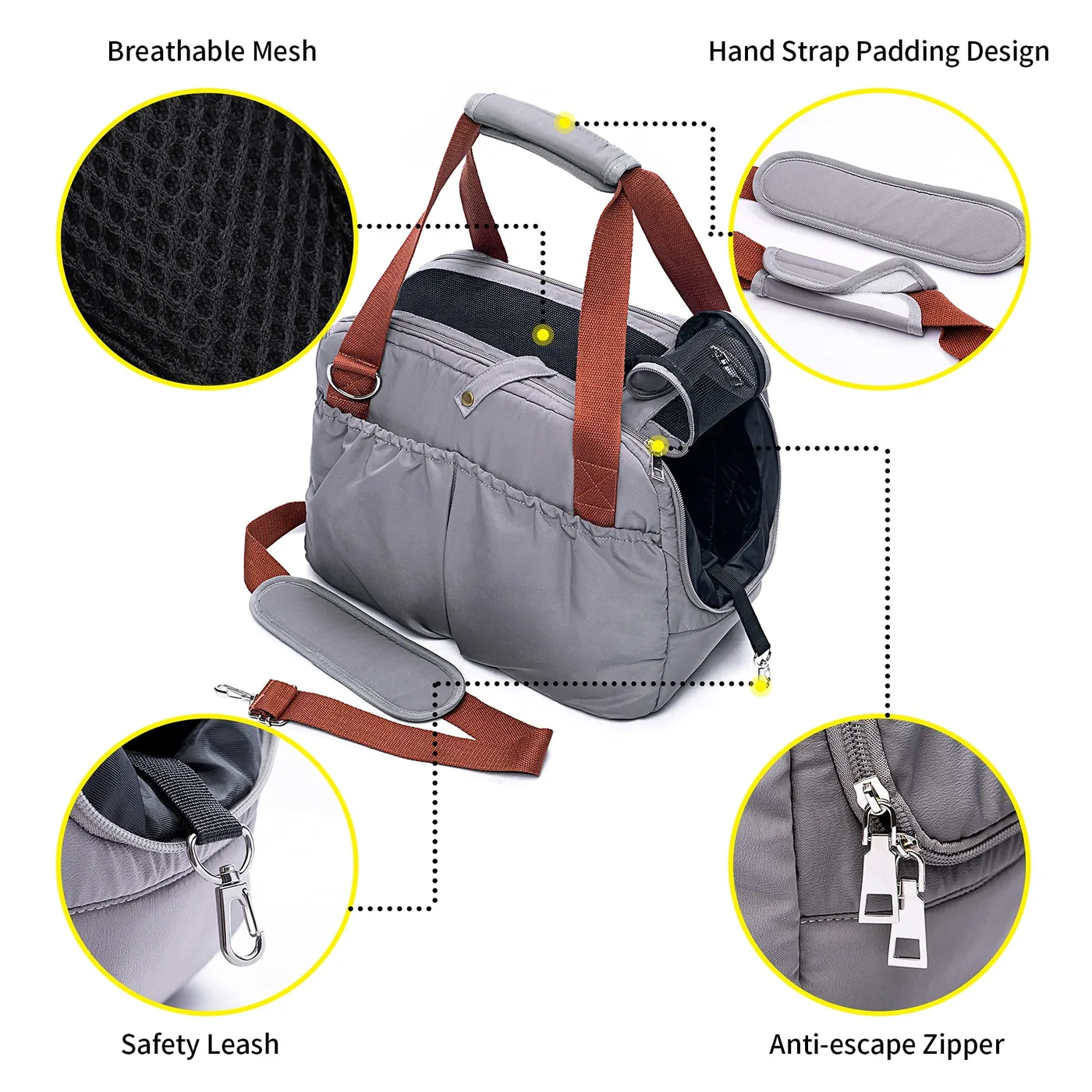
Mapping pattern across three-dimensional bodies
Flat artwork that looks perfect on a screen can collapse once wrapped around a carrier body, because every curved surface foreshortens the pattern differently. The three trouble spots are the transition from front panel to gusset, the area immediately around ventilation mesh, and the top panel where handles and opening zips interrupt the field.
The gusset transition is where geometry most often fails. A grid continuing around a corner without a deliberate break reads as accidental sloppiness. The professional solution is either to engineer a deliberate interruption using a solid binding tape or piping, or to reduce the repeat so that the break occurs within one motif rather than half-way across nine of them. Intentionality is what customers perceive, not perfection.
Mesh windows require the same discipline. An inset panel breaks the field, so the opening should be aligned to the grid where possible, ideally absorbing a whole number of repeats plus a symmetric margin. If that is impossible, deliberately oversizing the mesh so it reads as a distinct design element is far better than leaving a partially truncated row of shapes running into it.
- Front panel: align the dominant motif axis vertically with the zip line to reinforce symmetry.
- Base and feet: dark geometric blocks here hide soiling, which matters on any pet product.
- Strap anchors: keep high-contrast boundaries away from load points to reduce visible distortion.
- Interior: a tonal version of the same repeat inside creates a designer feel at very low added cost.
Two construction choices amplify geometry. Structured bodies with bonded fleece hold flatter panels, so patterns read truer; slouchy constructions introduce folds that break every straight line. The second is quilting: a vertical channel quilt can align beautifully with a grid, but a diamond quilt will fight it. Deciding this relationship before pattern lock is essential, and brands considering structure should review how construction interacts with printed faces before release.
One more area regularly overlooked is zip tape. A contrasting tape colour running along a geometric field either looks deliberate or looks like a mistake, depending on whether it aligns with a motif line. Specifying tape-to-panel alignment during pattern development costs nothing; discovering midway through bulk that every fifth unit has tape crossing a contrast block costs considerably more.
Finally, remember viewing distance. Patterns are judged at approximately 1.2 metres on shelf and at roughly 50 cm in use. Our design team reviews every geometric repeat at both distances before it is approved, because patterns optimised for one almost always underperform at the other.
Coordinating printed fabric with solid hardware and trims
A geometric print does not exist in isolation: it shares every product with webbing, zip tape, mesh, piping and metal hardware. Those solid elements are dyed or anodised separately and will not automatically agree with the printed colours, which is why coordination should begin at colour selection rather than at sample review.
The safest strategy is extraction. Pick every trim colour from the print itself, rather than choosing trims independently, and the entire product reads as one designed system. When clients instead bring in an unrelated trim colour, even a beautiful geometric print starts to look like stock fabric assembled from whatever was available.
Hardware finish deserves particular attention because metal only comes in a limited set of commercial finishes. Gunmetal and matte black behave quietly and tend to support any geometric palette; shiny rose gold fights cool-toned grids; and antiqued brass pulls the product toward heritage territory, which can genuinely work but changes the perceived modernness of the print. Hardware strength choices matter functionally too, since weight limits are often more consequential than colour.
Logo placement on geometric prints is a genuine design problem. A busy repeat swallows branding, and adding a bordered patch creates visual clutter. The consistently successful solutions are mono-colour logo execution inside one low-detail area of the repeat, a separate solid woven label placed deliberately outside the pattern field, or metal placement on hardware itself. Each reads as deliberate rather than as an afterthought.
Webbing is the easiest element to get right and the easiest to get wrong. A plain dyed webbing lifted from one print colour usually performs best, particularly where it runs across the pattern from strap anchor to strap anchor. Webbing material selection also frames cohesion, so decisions about width and weave should come at the same time as pattern lock.
Numerical specification protects all of this during scale-up. Every trim colour should carry a Pantone call-out recorded in the shared tech pack, supported by an approved physical swatch retained by both sides. That documentation is what prevents a reorder twelve months later from arriving with webbing one shade away from the original delivery, and it is also what allows a second production source to be introduced later without any visible change to the finished product.

Durability, testing and how geometry hides or reveals wear
High-contrast geometric prints have one predictable weakness: edge wear. Where a fabric folds or abrades, the first thing to fail visually is the boundary between light and dark, and geometry is nothing but boundaries. Base corners, strap contact points and the top zip line are the three locations where this shows up first, and they should influence both artwork and construction decisions.
The effective mitigations are design-led rather than chemical. Keeping light blocks away from the bottom 40 mm of the body, using a darker base panel that absorbs scuffing invisibly, and placing contrast boundaries where panels fold rather than where they rub will extend visual life substantially. All three cost nothing and yet deliver most of the available improvement.
Where testing is concerned, three checks matter most. Colourfastness to rubbing, because light-on-dark boundaries transfer visibly if the ink is poorly fixed. Abrasion resistance, because pile-up and thread breakage at corners read immediately on a grid. And dimensional stability after laundering, because differential shrinkage distorts repeat across panels and destroys alignment permanently.
Our production team benchmarks against the AATCC test methods for crocking and laundering, and every geometric program is inspected to AQL 2.5 with print-related faults treated as major defects. Because these are measurable and repeatable processes, disputes reduce to a discussion about numbers rather than opinions, which is what every serious private-label buyer wants.
One often overlooked point concerns sponge-cleaning. Owners wipe these carriers down frequently, and repeated wiping across a printed panel generates micro-abrasion precisely at colour boundaries. Specifying a print route with true penetration rather than surface deposition is the strongest defence, which is one more reason sublimation dominates this category.
Merchandising a modernist capsule across channels
Geometric prints block exceptionally well on shelf because they create visual rhythm across a run of products, and rhythm is what shoppers perceive as a brand. Where pictorial prints compete for attention one SKU at a time, a disciplined grid system makes three adjacent carriers read as a single deliberate collection from eight metres away.
Channel fit should drive palette decisions early. Specialty pet and urban lifestyle stores respond best to tonal two-colour systems with restrained contrast; sporting goods environments tolerate higher contrast and bolder block placement; and online-only programs can push optical contrast further because lifestyle photography provides context that a physical shelf does not.
Photography is the other half of geometry's advantage. Clean repeat patterns shoot predictably, retouch easily and survive heavy compression, which is why social-first brands disproportionately favour them. A reliable studio approach is overhead flat-lay for pattern clarity, plus one lifestyle frame demonstrating scale, since grids give a human (or animal) size reference that helps online buyers understand actual dimensions.
Packaging should be quieter than the product. Because the print already carries the pattern story, the hangtag can be a single solid colour with a small diecut window, allowing the fabric itself to do the work. This also reduces cost: the same generic tag can serve multiple colourways rather than requiring unique printing for each.
Finally, build the calendar for longevity rather than novelty. A geometric core line can remain unchanged for two or three years, refreshed only by rotating one accent colour, while seasonal capsules orbit around it. Brands that adopt this structure typically see steadier reorders and markedly fewer markdowns than those launching fresh artwork every six months, and the production efficiency gains make the entry-level tier genuinely viable.
Scale the project calendar to that longevity plan. Artwork lockdown generally needs to occur roughly four months before floor date: allow three weeks for repeat development, ten days for strike-off and physical sampling, 35-50 days for bulk production, and four to six weeks for freight and retail inbound processing. Programs planned backwards from that model rarely need expediting, and are able to reinvest the savings into better hardware rather than emergency air freight.
Why brands source here
- Pet carrier programs run since 2014; founding team in sewn goods since 2004
- SGS-verified production floor of 4,950 m² with 137 workers across 7 lines
- Monthly capacity of 200,000 units, audited to BSCI and ISO 9001
People Also Ask
Is a geometric print too busy for a pet carrier?
Not if it is restrained. Two-colour systems with 6-10 cm repeats read as clean and modern, while busy multi-colour prints above four colours lose identity at shelf distance. The test is simple: if the pattern still reads clearly at three metres, it is working.
Why do printed grids sometimes fail to line up at seams?
Three causes dominate: cutting variance, heat-shrink distortion during transfer, and a vertical repeat that does not divide evenly into panel height. Each is solved before production rather than during it, using mock markers, pre-shrink compensation and repeat adjustment.
Which print method gives the sharpest geometric edges?
Heat-transfer sublimation on polyester provides the crispest edges because dye is fixed inside the fibre with no mechanical dot gain. Rotary screen gives consistent mechanical registration for very long runs, while digital output suits prototypes and short capsules.
How many colours should a modern geometric print use?
Two plus ground is the sweet spot. It keeps print surcharge near USD 0.55-0.95 per unit, normally requires only one or two sampling rounds, and stays versatile enough to coordinate across an entire product family.
Do geometric prints show dirt and wear more than solids?
Light-on-dark boundaries reveal abrasion first, so plan contrast placement carefully. Keeping pale blocks away from the bottom 40 mm of the body and using a darker base panel preserves appearance through years of daily use.
Can geometric prints be matched across multiple product categories?
Yes. Because the repeat is defined numerically rather than drawn, the same file can be scaled for carriers, mats, travel bowls and apparel accessories. Consistent scaling rules are documented in the shared tech pack for each program.
Frequently Asked Questions
What is the MOQ for a custom geometric print carrier line?
A geometric program starts at 500 pieces per colourway. Several silhouettes can share one purchase order provided each colourway clears the minimum, so a single commitment can cover a backpack-style carrier, a tote and a sling printed from the same repeat file.
How long does sampling take for a new geometric repeat?
Physical samples leave our production team within 6-10 working days of approved artwork. Repeats are vector-based, so recolouring an existing geometric file frequently goes straight to strike-off with no additional development time required.
Can you create a geometric repeat from our existing brand artwork?
Yes. Existing pattern assets can be adapted for larger or smaller scale, retiled for different panel geometry, or simplified into fewer colours to improve print economics. Provide vector files where available so fidelity is preserved through conversion.
Which carrier structures suit geometric prints best?
Structured bodies with bonded reinforcement hold flatter panels and show truer lines, while slouchy constructions introduce folds that break straight edges. If a structured body is not desired, choose softer contrast levels so fold shadows are less visible.
How tight should registration tolerance be specified?
Specify ±1 mm for chevron and op-art work and ±2 mm for simple grids. Our production team pre-compensates heat-shrink distortion per substrate before any bulk job runs, and inspects against overlay templates during production.
Do you use engineered panel printing for chevron designs?
Engineered printing, where each panel is printed individually, is available for designs that cannot tolerate breaks at seams. It typically adds USD 0.90-1.60 per unit but removes the recurring complaint of partial motifs appearing at gussets.
How do we keep solid trims matching the printed colours?
Webbing, zip tape, mesh and binding are dyed to a reference lifted directly from the print rather than chosen independently. One shared swatch goes to both the print and dye operations, so every element is judged against the same physical standard.
What hardware finishes work with modern geometric palettes?
Gunmetal and matte black are the safest choices for cool-toned geometry, while antiqued brass shifts the product toward heritage styling. Finish availability is limited, so decide the hardware before finalising the print palette rather than after.
Are printed geometric panels durable under daily wiping?
Yes, provided the print penetrates rather than sits on the surface. Sublimation dye diffuses into the fibre, so wiping and corner abrasion expose more colour instead of a pale core, and crocking results typically reach grade 4-5.
Can the same repeat support multiple seasons?
Very effectively. Rotating one accent colour while keeping the base geometry unchanged refreshes the line without redrawing artwork, which dramatically shortens development time for second-season capsules and reduces sampling rounds.
What inspection level applies to printed geometric runs?
Every shipment is inspected to AQL 2.5 with print faults classified as major defects. Registration drift beyond tolerance, colour deviation from the signed swatch, banding and ink marks all count against acceptance.
Do you offer children's product safety documentation for pet items?
Pet carriers fall outside children's product rules, but we still specify restricted-substance-compliant inks for any program sold alongside juvenile ranges. Documentation can be bundled with the standard test report set on request.
What file formats are best for submitting geometric artwork?
Vector AI, EPS or SVG files with all live text converted to outlines are ideal. Colour should be called out with Pantone references rather than screen values, and each repeat should be delivered with a clearly marked one-tile label.
What are the payment and shipping terms?
Terms are T/T 30/70 with FOB Xiamen and a complete document set per shipment. Sea freight is standard for seasonal programs; air freight is used for selling-window reorders or urgently needed launch samples.
Talk to QUANZHOU JUNYUAN BAGS about a pet carrier program: MOQ 500 pieces per colourway, samples in 6-10 working days, bulk production in 35-50 days under AQL 2.5 inspection.
Get a free quote Request a sample