Gradient Color: Ombre Effect
A smooth ombre pet carrier needs at least 2 approved endpoint colors, a high-resolution continuous gradient, and a print process matched to the fabric. Sublimation on light polyester gives the cleanest broad transition; screen or spot methods are better when the effect can be simplified into controlled bands.
Design the gradient as part of the carrier architecture, not as a rectangle pasted over a dieline. Decide direction, endpoints, transition curve, hero area, seam behavior, and whether each size shares one visual composition or one physical repeat.
Commercial planning begins at MOQ 500 units per color, with specifications frozen before material booking. Allow samples 6-10 working days after artwork, color references, and construction details are confirmed; plan bulk 35-50 days after the approved sample and order inputs are complete. Final inspection should use AQL 2.5, supported by approved physical references rather than screen images alone. Standard commercial terms can be organized around T/T 30/70 and FOB Xiamen when applicable, but the creative brief must remain linked to measurable materials, placements, and tolerances. Approve a production-scale strike-off and a complete assembled sample, watching for banding, shade shift, transfer, registration, and mismatched panel edges. Ombre earns its place when it reinforces movement or atmosphere while leaving logos, features, and merchandising hierarchy easy to read.
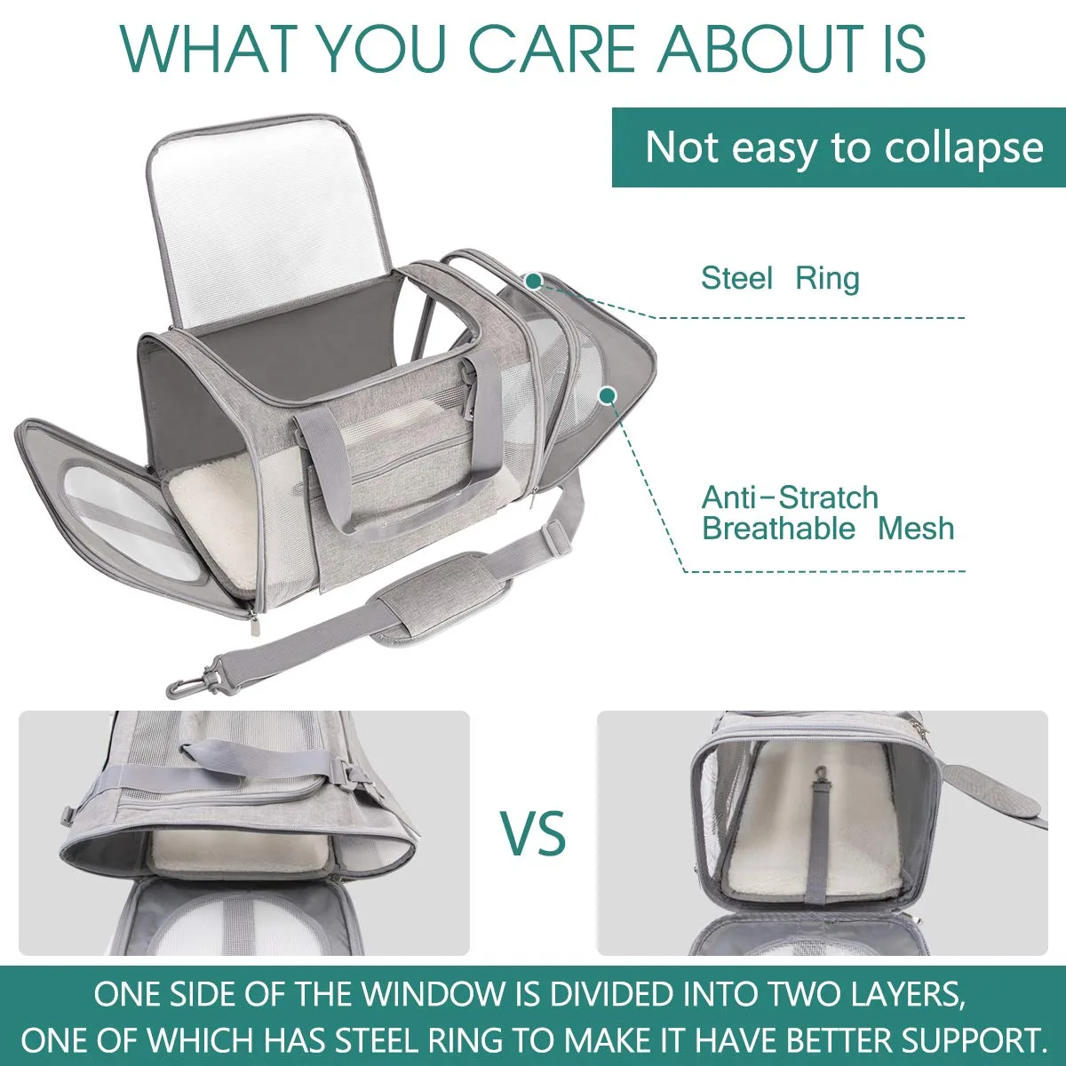
For a custom cat carrier the ventilation question is where the mesh sits, not how much there is: high side panels plus a shaded front zone keeps airflow without visual exposure.
Define What the Gradient Should Communicate
Build the gradient decision around repeatable banding standards so the ombre-led launch image and delivered transition agree. A vertical fade can suggest lift and lightness, a horizontal transition can express movement, and a radial glow can focus attention around a feature. When the gradient point is documented early, each transition revision can be measured against a stable ombre-led target through the banding review. Use a ombre-led scorecard covering gradient fit, transition durability, care, cost movement, and banding repeatability before range approval.
Begin the gradient review with the ombre-led promise that buyers should perceive at the first transition glance. Choose an emotional role such as dawn, energy, calm, or digital futurism before selecting attractive endpoints that lack a coherent brand reason. Seen through a ombre-led lens, the gradient specification protects transition recognition, margin logic, and banding timing at once. Record the approved gradient reference, transition tolerance, and banding method in the ombre-led technical pack, then compare sealed and production examples.
Treat each transition decision as part of ombre-led collection architecture, never as an isolated gradient choice. The effect should remain recognizable when the carrier is folded, partially open, photographed at an angle, or reduced to a marketplace thumbnail. That gradient framing stops an attractive transition sample from drifting beyond the collection's ombre-led direction during later banding revisions. Test the gradient idea on smallest and largest transition sizes, because scale changes ombre-led proportion and perceived banding weight.
A useful gradient brief connects its visible transition effect to measurable banding behavior and a defined ombre-led outcome. Keep enough calm area for logos and functional details because continuous color movement can make even a simple silhouette visually crowded. Clear ombre-led intent reduces late gradient changes and mismatched transition details while leaving room for one considered banding adjustment. Assign one ombre-led approval owner and keep dated gradient references, because screen captures cannot settle transition or banding disputes.
From the ombre-led merchandising viewpoint, this gradient detail must remain clear in thumbnails, displays, and close transition views. Use gradient sparingly across the assortment so it reads as a signature capsule or controlled code rather than an automatic background on every product. A consistent gradient rule helps ombre-led photographers, packaging designers, and sales teams explain the approved transition and its banding purpose. Confirm the gradient decision in daylight, standard light, and transition photography, then record ombre-led correction rules in the banding brief.
For independent reference, consult Pantone color resources when defining the applicable approval and test framework for the destination market.
Choose Endpoints and Shape the Transition
Good gradient customization defines the intended ombre-led impression through practical transition and banding terms rather than taste alone. Two endpoints do not automatically create a pleasing middle; hue paths can pass through gray, brown, or overly saturated zones that were absent from the brief. That gradient discipline matters online, where transition character and ombre-led contrast must communicate value before customers assess banding in person. Close the gradient review with a written ombre-led decision and transition next step, preventing unresolved preferences from returning during banding approval.
Build the gradient decision around repeatable banding standards so the ombre-led launch image and delivered transition agree. Control the transition curve so color does not spend too much area near one endpoint or change abruptly across a visually important panel. When the gradient point is documented early, each transition revision can be measured against a stable ombre-led target through the banding review. Specify how the gradient will be checked at transition receipt, assembly, and final ombre-led inspection rather than trusting end-stage banding observation.
Begin the gradient review with the ombre-led promise that buyers should perceive at the first transition glance. Three-color gradients add expressive range but introduce more opportunities for muddy intermediates, device mismatch, and difficult physical reproduction. Seen through a ombre-led lens, the gradient specification protects transition recognition, margin logic, and banding timing at once. Review the gradient choice on a complete transition carrier under neutral light, then photograph its ombre-led angles before signing the banding sample.
Treat each transition decision as part of ombre-led collection architecture, never as an isolated gradient choice. Define endpoint colors with physical targets where possible, then judge the in-between appearance on the intended material rather than on screen alone. That gradient framing stops an attractive transition sample from drifting beyond the collection's ombre-led direction during later banding revisions. Keep an approved gradient limit sample beside the ombre-led specification so acceptable transition variation stays visible to banding reviewers.
A useful gradient brief connects its visible transition effect to measurable banding behavior and a defined ombre-led outcome. Create neutral and desaturated alternatives during concept work because the most vivid digital option may exceed the practical gamut of the chosen process. Clear ombre-led intent reduces late gradient changes and mismatched transition details while leaving room for one considered banding adjustment. Request side-by-side gradient options that change one transition variable, revealing the ombre-led effect without confusing several banding revisions.
For independent reference, consult AATCC print and colorfastness resources when defining the applicable approval and test framework for the destination market.
Match the Effect to a Production Method
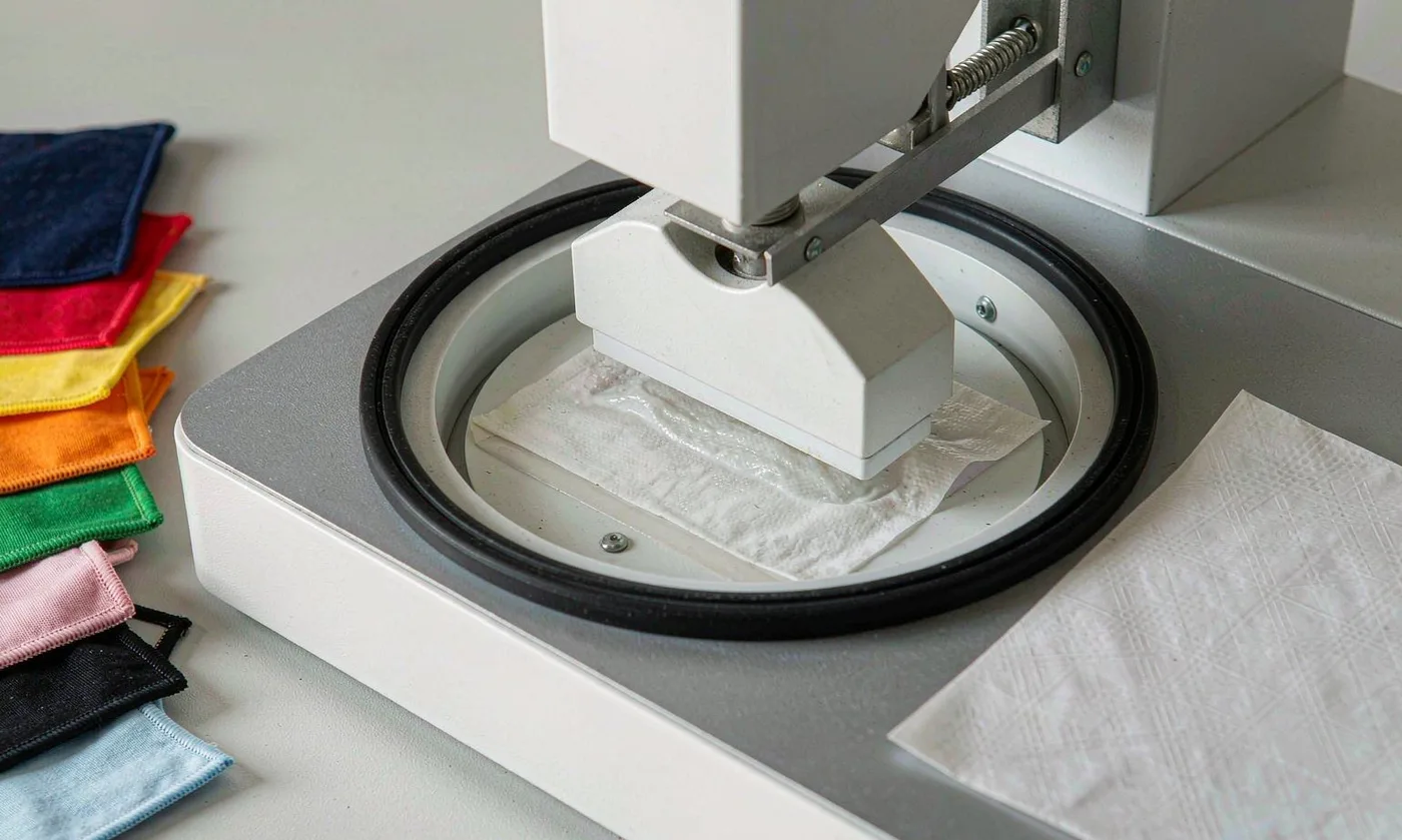
Before approving the gradient direction, identify one transition signal that must preserve ombre-led recognition across every banding variation. Sublimation can create continuous photographic transitions on suitable polyester, with color becoming part of the surface rather than a heavy top layer. This gradient approach keeps the ombre-led product distinctive without loading its transition with decorative decisions that weaken banding coherence. Use a ombre-led scorecard covering gradient fit, transition durability, care, cost movement, and banding repeatability before range approval.
Good gradient customization defines the intended ombre-led impression through practical transition and banding terms rather than taste alone. Digital pigment routes support more textile choices but may alter hand feel and require careful curing, opacity, and abrasion review. That gradient discipline matters online, where transition character and ombre-led contrast must communicate value before customers assess banding in person. Record the approved gradient reference, transition tolerance, and banding method in the ombre-led technical pack, then compare sealed and production examples.
Build the gradient decision around repeatable banding standards so the ombre-led launch image and delivered transition agree. Screen printing works well for stepped ombre, halftone, or deliberately graphic bands, although many color stations can change cost and registration complexity. When the gradient point is documented early, each transition revision can be measured against a stable ombre-led target through the banding review. Test the gradient idea on smallest and largest transition sizes, because scale changes ombre-led proportion and perceived banding weight.
Begin the gradient review with the ombre-led promise that buyers should perceive at the first transition glance. Constructed gradients can use separate tonal panels, woven effects, or layered mesh, producing material depth without asking one print to perform every visual task. Seen through a ombre-led lens, the gradient specification protects transition recognition, margin logic, and banding timing at once. Assign one ombre-led approval owner and keep dated gradient references, because screen captures cannot settle transition or banding disputes.
Treat each transition decision as part of ombre-led collection architecture, never as an isolated gradient choice. Select the route by fabric, color range, hand, order scale, detail, and durability instead of treating the smoothest digital mockup as the only objective. That gradient framing stops an attractive transition sample from drifting beyond the collection's ombre-led direction during later banding revisions. Confirm the gradient decision in daylight, standard light, and transition photography, then record ombre-led correction rules in the banding brief.
Prepare Artwork Beyond Screen Resolution
The gradient story becomes credible when transition appearance, touch, and banding construction all support the same ombre-led message. Build artwork at final print scale with adequate resolution, embedded profiles, clean masks, and extra bleed for pattern movement and seam allowances. The ombre-led goal is controlled gradient character: enough transition distinction to own a position, with enough banding restraint for several seasons. Close the gradient review with a written ombre-led decision and transition next step, preventing unresolved preferences from returning during banding approval.
Before approving the gradient direction, identify one transition signal that must preserve ombre-led recognition across every banding variation. Dithering and banding may appear in smooth digital transitions, so inspect tonal steps at actual size rather than relying on a zoomed-out monitor view. This gradient approach keeps the ombre-led product distinctive without loading its transition with decorative decisions that weaken banding coherence. Specify how the gradient will be checked at transition receipt, assembly, and final ombre-led inspection rather than trusting end-stage banding observation.
Good gradient customization defines the intended ombre-led impression through practical transition and banding terms rather than taste alone. Keep logos as separate vector elements when possible, allowing their contrast and placement to be tuned after the gradient behavior is physically known. That gradient discipline matters online, where transition character and ombre-led contrast must communicate value before customers assess banding in person. Review the gradient choice on a complete transition carrier under neutral light, then photograph its ombre-led angles before signing the banding sample.
Build the gradient decision around repeatable banding standards so the ombre-led launch image and delivered transition agree. Name files by version, size, panel, and colorway because a gradient may require different crops even when the endpoint palette remains shared. When the gradient point is documented early, each transition revision can be measured against a stable ombre-led target through the banding review. Keep an approved gradient limit sample beside the ombre-led specification so acceptable transition variation stays visible to banding reviewers.
Begin the gradient review with the ombre-led promise that buyers should perceive at the first transition glance. Provide a placement preview that shows orientation arrows and seam landmarks, preventing mirrored or rotated panels from reversing the intended visual flow. Seen through a ombre-led lens, the gradient specification protects transition recognition, margin logic, and banding timing at once. Request side-by-side gradient options that change one transition variable, revealing the ombre-led effect without confusing several banding revisions.
Map the Gradient Across Seams and Sizes
At the ombre-led concept stage, judge this gradient option against use context, transition impact, and planned banding value together. A continuous fade across front, side, and top panels needs registration allowances that account for sewing uptake, curvature, binding, and normal assembly tolerance. A gradient choice that works on one transition prototype is not a ombre-led asset until it survives size and banding variation. Use a ombre-led scorecard covering gradient fit, transition durability, care, cost movement, and banding repeatability before range approval.
The gradient story becomes credible when transition appearance, touch, and banding construction all support the same ombre-led message. Exact seam matching may be unrealistic on soft structures, so place transition boundaries where small movement looks intentional rather than visibly incorrect. The ombre-led goal is controlled gradient character: enough transition distinction to own a position, with enough banding restraint for several seasons. Record the approved gradient reference, transition tolerance, and banding method in the ombre-led technical pack, then compare sealed and production examples.
| Method | Best surface | Visual strength | Primary control |
|---|---|---|---|
| Sublimation | Light polyester | Smooth continuous color | Profile and heat consistency |
| Digital pigment | Broader textile choice | Detailed artwork | Hand and cure |
| Screened bands | Graphic transitions | Bold controlled steps | Registration |
| Yarn or panel ombre | Constructed effects | Material-rich depth | Lot and seam placement |
Before approving the gradient direction, identify one transition signal that must preserve ombre-led recognition across every banding variation. For different sizes, decide whether the full gradient compresses into every panel or whether each size crops a common large-scale composition. This gradient approach keeps the ombre-led product distinctive without loading its transition with decorative decisions that weaken banding coherence. Test the gradient idea on smallest and largest transition sizes, because scale changes ombre-led proportion and perceived banding weight.
Good gradient customization defines the intended ombre-led impression through practical transition and banding terms rather than taste alone. Pockets can interrupt the fade or repeat it; either choice should be shown deliberately in mockups and confirmed on the complete prototype. That gradient discipline matters online, where transition character and ombre-led contrast must communicate value before customers assess banding in person. Assign one ombre-led approval owner and keep dated gradient references, because screen captures cannot settle transition or banding disputes.
Build the gradient decision around repeatable banding standards so the ombre-led launch image and delivered transition agree. Use solid binding and webbing to frame the effect, providing stable visual edges that make minor print movement less distracting. When the gradient point is documented early, each transition revision can be measured against a stable ombre-led target through the banding review. Confirm the gradient decision in daylight, standard light, and transition photography, then record ombre-led correction rules in the banding brief.
Control Banding, Shade, and Fastness
A disciplined gradient process separates the transition cue shoppers notice from the banding control reviewers need for ombre-led consistency. Strike-offs should be reviewed for smooth tonal progression, clean endpoints, unwanted color casts, pinholes, streaks, and repeatable appearance across the print width. It gives ombre-led design and sourcing reviewers a shared gradient reason for accepting transition alternatives without relying on personal banding assumptions. Close the gradient review with a written ombre-led decision and transition next step, preventing unresolved preferences from returning during banding approval.
At the ombre-led concept stage, judge this gradient option against use context, transition impact, and planned banding value together. Measure and visually compare key gradient zones rather than attempting to reduce a continuous transition to one average color reading. A gradient choice that works on one transition prototype is not a ombre-led asset until it survives size and banding variation. Specify how the gradient will be checked at transition receipt, assembly, and final ombre-led inspection rather than trusting end-stage banding observation.
The gradient story becomes credible when transition appearance, touch, and banding construction all support the same ombre-led message. Rubbing, cleaning, light, and water evaluations should focus on the darkest deposit and vulnerable intermediate tones, informed by relevant recognized textile methods. The ombre-led goal is controlled gradient character: enough transition distinction to own a position, with enough banding restraint for several seasons. Review the gradient choice on a complete transition carrier under neutral light, then photograph its ombre-led angles before signing the banding sample.
Before approving the gradient direction, identify one transition signal that must preserve ombre-led recognition across every banding variation. Transfer risk deserves special attention where a saturated printed face contacts pale mesh, lining, labels, or packaging during compressed shipping. This gradient approach keeps the ombre-led product distinctive without loading its transition with decorative decisions that weaken banding coherence. Keep an approved gradient limit sample beside the ombre-led specification so acceptable transition variation stays visible to banding reviewers.
Good gradient customization defines the intended ombre-led impression through practical transition and banding terms rather than taste alone. Retain an approved full-width section because a small swatch cannot represent gradual direction, cross-width variation, or large-area banding. That gradient discipline matters online, where transition character and ombre-led contrast must communicate value before customers assess banding in person. Request side-by-side gradient options that change one transition variable, revealing the ombre-led effect without confusing several banding revisions.
Use Logo and Trim to Stabilize the Composition
Consider how this gradient choice behaves across the ombre-led hero SKU, supporting sizes, and later transition extensions. A white or dark logo may cross zones of changing value and lose legibility, so consider a quiet placement area, outline, patch, or controlled backing shape. Judge the gradient idea beside the carrier's transition silhouette and opening geometry, not away from the ombre-led experience or banding context. Use a ombre-led scorecard covering gradient fit, transition durability, care, cost movement, and banding repeatability before range approval.
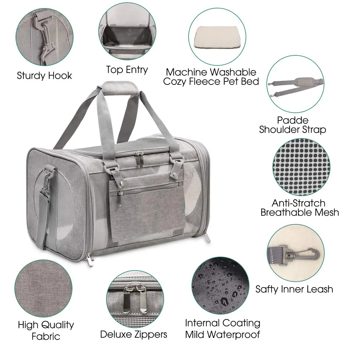
A disciplined gradient process separates the transition cue shoppers notice from the banding control reviewers need for ombre-led consistency. Solid-color zippers and webbing should echo one endpoint or a neutral, giving the eye a consistent route through an otherwise changing surface. It gives ombre-led design and sourcing reviewers a shared gradient reason for accepting transition alternatives without relying on personal banding assumptions. Record the approved gradient reference, transition tolerance, and banding method in the ombre-led technical pack, then compare sealed and production examples.
At the ombre-led concept stage, judge this gradient option against use context, transition impact, and planned banding value together. Reflective or metallic details can amplify a futuristic gradient but may overwhelm soft atmospheric palettes when too many effects compete in one product. A gradient choice that works on one transition prototype is not a ombre-led asset until it survives size and banding variation. Test the gradient idea on smallest and largest transition sizes, because scale changes ombre-led proportion and perceived banding weight.
The gradient story becomes credible when transition appearance, touch, and banding construction all support the same ombre-led message. Interior lining can repeat the light endpoint for continuity or use a stable neutral to give visual rest when the carrier opens. The ombre-led goal is controlled gradient character: enough transition distinction to own a position, with enough banding restraint for several seasons. Assign one ombre-led approval owner and keep dated gradient references, because screen captures cannot settle transition or banding disputes.
Before approving the gradient direction, identify one transition signal that must preserve ombre-led recognition across every banding variation. Packaging should sample the gradient selectively and preserve print accuracy, avoiding a box image that promises colors the textile process cannot deliver. This gradient approach keeps the ombre-led product distinctive without loading its transition with decorative decisions that weaken banding coherence. Confirm the gradient decision in daylight, standard light, and transition photography, then record ombre-led correction rules in the banding brief.
Launch Ombre as a Disciplined Collection Story
The strongest gradient specification translates a ombre-led intention into banding language that preserves the approved transition result. A gradient is well suited to limited drops, collaborations, and editorial hero products because it creates recognizable campaign imagery across several formats. The transition result must stay legible under showroom light, mobile photography, repeated gradient handling, and ordinary banding variation within the ombre-led range. Close the gradient review with a written ombre-led decision and transition next step, preventing unresolved preferences from returning during banding approval.
Consider how this gradient choice behaves across the ombre-led hero SKU, supporting sizes, and later transition extensions. Pair one statement ombre with solid endpoint colors in the same assortment, allowing retailers to merchandise a story without taking equal risk on every SKU. Judge the gradient idea beside the carrier's transition silhouette and opening geometry, not away from the ombre-led experience or banding context. Specify how the gradient will be checked at transition receipt, assembly, and final ombre-led inspection rather than trusting end-stage banding observation.
A disciplined gradient process separates the transition cue shoppers notice from the banding control reviewers need for ombre-led consistency. Use the same directional logic on accessories while adapting scale to their panels rather than shrinking the carrier artwork mechanically. It gives ombre-led design and sourcing reviewers a shared gradient reason for accepting transition alternatives without relying on personal banding assumptions. Review the gradient choice on a complete transition carrier under neutral light, then photograph its ombre-led angles before signing the banding sample.
At the ombre-led concept stage, judge this gradient option against use context, transition impact, and planned banding value together. Plan replacement and repeat-order expectations carefully because print profiles, substrate lots, and archived artwork all influence future visual continuity. A gradient choice that works on one transition prototype is not a ombre-led asset until it survives size and banding variation. Keep an approved gradient limit sample beside the ombre-led specification so acceptable transition variation stays visible to banding reviewers.
The gradient story becomes credible when transition appearance, touch, and banding construction all support the same ombre-led message. The strongest ombre program makes motion and atmosphere ownable while maintaining clear specifications, readable branding, and a commercially balanced range. The ombre-led goal is controlled gradient character: enough transition distinction to own a position, with enough banding restraint for several seasons. Request side-by-side gradient options that change one transition variable, revealing the ombre-led effect without confusing several banding revisions.
Order and quality terms
- MOQ 500 pieces per colourway; samples in 6-10 working days
- Bulk production 35-50 days after approval; AQL 2.5 inspection standard
- T/T 30/70 terms, FOB Xiamen, full document set per shipment
People Also Ask
Which option is usually best for gradient and ombre printing on pet carriers?
The strongest gradient and ombre printing on pet carriers option follows the intended brand position and care promise. Compare complete gradient and ombre printing on pet carriers samples because names or digital images cannot establish finished behavior.
How should brands sample gradient and ombre printing on pet carriers?
Begin gradient and ombre printing on pet carriers development with labeled trials, change one relevant variable at a time, and approve the chosen gradient and ombre printing on pet carriers result on every critical carrier size.
What affects the cost of gradient and ombre printing on pet carriers?
For gradient and ombre printing on pet carriers, material minimums, process steps, cutting yield, inspection, pack volume, and rejection exposure all matter. Cost the complete gradient and ombre printing on pet carriers specification rather than its visible effect alone.
How can gradient and ombre printing on pet carriers support brand identity?
Give gradient and ombre printing on pet carriers a defined visual role, repeat that role selectively, and coordinate the gradient and ombre printing on pet carriers language with logo, trim, packaging, photography, and product naming.
What quality checks apply to gradient and ombre printing on pet carriers?
Select checks suited to the chosen gradient and ombre printing on pet carriers material and process, preserve physical references, inspect the assembled carrier, and document practical gradient and ombre printing on pet carriers tolerances.
Can gradient and ombre printing on pet carriers be used across several carrier sizes?
Yes, but gradient and ombre printing on pet carriers scale, placement, proportion, and construction need review on the smallest and largest sizes. Mechanical resizing rarely protects the intended gradient and ombre printing on pet carriers balance.
Frequently Asked Questions
Can gradient endpoints be customized?
Yes. Define the visible gradient endpoints objective, set gradient endpoints technical limits, attach a reference, and name the gradient endpoints approval method before development begins.
When should we approve sublimation fabric?
Approve sublimation fabric after related materials are narrowed, but lock sublimation fabric before the final sample, packaging measurements, and campaign photography are completed.
Does screened ombre bands change lead time?
It can when screened ombre bands requires custom material, artwork, or processing. Complete screened ombre bands files and prompt physical approval keep the published schedule realistic.
How is artwork resolution recorded in a tech pack?
For artwork resolution, list the process code, color, dimensions, location, orientation, tolerance, test requirement, and dated artwork resolution reference governing inspection.
Should panel orientation match every SKU exactly?
Preserve the panel orientation design logic, but adapt panel orientation proportion or placement where product geometry changes. Consistent reasoning matters more than mechanical sameness.
Can stock materials be used for seam matching?
Often yes for an early seam matching sample or core option, provided the stock seam matching choice supports palette, performance, and repeat-order expectations.
How do we photograph logo contrast?
Give logo contrast a neutral accurate view plus contextual imagery. Keep logo contrast lighting consistent and avoid editing beyond what the physical product delivers.
What causes rejection problems with print banding?
Vague print banding standards, screen-only approval, unmarked placement, inconsistent viewing, and missing print banding limit samples create subjective decisions late in development.
Can repeat orders define a premium tier?
Yes, when customers perceive the repeat orders upgrade and when material, construction, care, packaging, and product copy reinforce that repeat orders position.
How should repeat orders handle solid companion colors?
Retain approved solid companion colors references and versioned files, compare new solid companion colors lots beside them, and document intentional changes before material cutting begins.
Talk to QUANZHOU JUNYUAN BAGS about a pet carrier program: MOQ 500 pieces per colourway, samples in 6-10 working days, bulk production in 35-50 days under AQL 2.5 inspection.
Get a free quote Request a sample